COMMON BOND: An Interview with Graphic Designer Henk van Assen

There is something of an old-dogged craftsmanship quality in how the letters are created individually. But when put together as text, the rhythm and combination of forms makes for a excellent and fluid reading experience. The font feels both unique and unobtrusive simultaneously. Of course, knowing Tobias personally and having long been a fan of pretty much all his work, no surprise then that one of his fonts became the ultimate choice.
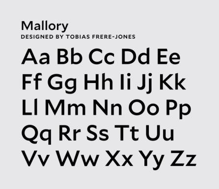
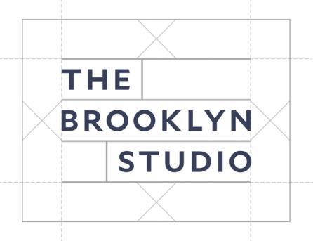
White space is also an integral part of the visual mark itself. It has ample space both around and in between the letters to give it a calm and confident yet elegant feel.
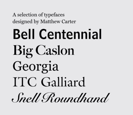
During my graduate studies at Yale, I was, again, very lucky to be able to work with Matthew Carter, the typeface designer of too many fonts to name here. His career, in my opinion, is most remarkable though in how he continued to reinvent his work based on the ever-evolving technologies in the field. He started with arcane punch cutting for Enschede, a type setting company in Holland where he was doing an internship, to the present, creating highly sophisticated digital font families for institutional and commercial clients.
